As software engineers, we’re constantly striving to deliver the fastest, most seamless web experiences possible. In today’s interconnected digital landscape, that often means integrating a variety of third-party content – from analytics and ads to rich user-generated content like ratings and reviews. While these integrations are essential, they introduce a common performance challenge: network latency. Every time your browser needs to fetch something from a new domain, it incurs a series of network round-trips for DNS resolution, TCP handshake, and, for secure connections, TLS negotiation.1 These cumulative delays can significantly impact your page’s load time and, critically, your users’ perception of speed.
This is where resource hints become invaluable. These simple HTML <link> elements act as early signals to the browser, proactively informing it about resources that are likely to be needed soon.3 By leveraging these hints, we can instruct the browser to perform speculative network operations in the background, effectively masking latency and improving perceived performance.
For a company like Bazaarvoice, which delivers embedded ratings and reviews across a vast network of retail and brand websites, performance isn’t just an optimization; it’s a core business driver. Our content is a critical touchpoint for user engagement on product pages. The primary performance bottleneck for a website integrating Bazaarvoice content isn’t typically the payload size, but the overhead of initiating communication with our servers.This initial connection setup is crucial for optimizing Largest Contentful Paint (LCP), a key metric within Core Web Vitals, which measures page loading performance and influences user perception of speed. Preconnect is precisely designed to address this, allowing the browser to establish connections preemptively so our content loads and renders significantly faster, directly boosting the host site’s performance.4
This article explores Bazaarvoice’s strategy for optimizing third-party content delivery. It demonstrates how preconnect can significantly enhance frontend performance while incurring minimal to no additional call costs, addressing often-ignored backend implications.
Resource Hints: Your Browser’s Proactive Network Assistant
Understanding the nuances of various resource hints is crucial for their effective application. Each hint serves a distinct purpose, operating at different stages of the network request lifecycle and offering varying levels of performance gain versus resource overhead.
- dns-prefetch: A subtle hint, this directive tells the browser to resolve a domain’s DNS before requesting resources 6. Useful for future cross-origin access, it’s a low-overhead optimization that primarily reduces DNS lookup latency.
- Usage:
<link rel="dns-prefetch" href="https://api.bazaarvoice.com">
- Usage:
- preconnect: This hint goes a step further than dns-prefetch. It instructs the browser to proactively establish a full connection—encompassing DNS resolution, TCP handshake, and for HTTPS, the TLS negotiation—to a critical third-party origin.3 This pre-establishment significantly reduces the cumulative round-trip latency that would otherwise occur when the actual resource is requested.
- The Full Network Handshake:
- DNS Lookup: Resolves the domain name to its IP address.1
- TCP Handshake: The three-way handshake (SYN, SYN-ACK, ACK) to set up a reliable connection.
- TLS Negotiation: For HTTPS, the complex exchange of cryptographic keys and certificates to establish an encrypted channel.1
- crossorigin Attribute: For resources loaded in anonymous mode (e.g., web fonts) or those requiring Cross-Origin Resource Sharing (CORS), the crossorigin attribute must be set on the
<link rel="preconnect">tag. Without it, the browser might only perform the DNS lookup, negating the TCP and TLS benefits.6 - Important Distinction: It’s crucial to distinguish
rel="preconnect"(a browser directive to pre-establish a connection for future HTTP/HTTPS requests) from the HTTP CONNECT method. The HTTP CONNECT method is used for creating TCP tunnels through proxies (e.g., for secure communication over HTTP proxies or VPN-like scenarios). While both involve connection setup, their purposes and mechanisms are distinct. - Usage:
<link rel="preconnect" href="https://api.bazaarvoice.com" crossorigin>3
- The Full Network Handshake:
- preload: A high-priority instruction for the browser to fetch and cache resources (like scripts or styles) essential for the current page’s rendering, even if discovered late.9 It initiates an early fetch, unlike preconnect which only establishes a connection. Requires the as attribute for resource type10.
- Usage:
<link rel="preload" href="styles.css" as="style">3.
- Usage:
- prefetch: This browser hint suggests that a resource may be required for future navigations or interactions.1 It’s a speculative fetch designed to accelerate subsequent user journeys (e.g., prefetching the next page in a multi-step form). Resources are fetched and stored in the browser’s cache, ideally during idle periods when network resources are not under contention.14
- Usage:
<link rel="prefetch" href="reviews.html">13
- Usage:
- prerender: The most aggressive resource hint. It instructs the browser to not only fetch but also execute an entire page in the background.1 If the user then navigates to that page, it can appear almost instantaneously. Due to its high resource consumption (bandwidth, CPU, memory), it’s often deprecated or used with extreme caution.1
Here’s a quick comparison of these hints:
| Hint Type | Purpose | Network Stages Covered | Overhead/Risk | Optimal Use Case |
|---|---|---|---|---|
| dns-prefetch | Resolve domain names early | DNS | Minimal | Many cross-origin domains, non-critical |
| preconnect | Establish full connection early | DNS, TCP, TLS | Client CPU, minor bandwidth for TLS certs | Critical cross-origin domains (1-3) |
| preload | Fetch critical resource for current page | DNS, TCP, TLS, Data Fetch | Can disrupt browser priorities if misused | Critical resources needed early in render |
| prefetch | Speculatively fetch resource for future navigation | DNS, TCP, TLS, Data Fetch | Bandwidth waste if unused, skewed analytics | Resources for likely next page/interaction |
The Preconnect Advantage: Accelerating Third-Party Content Delivery
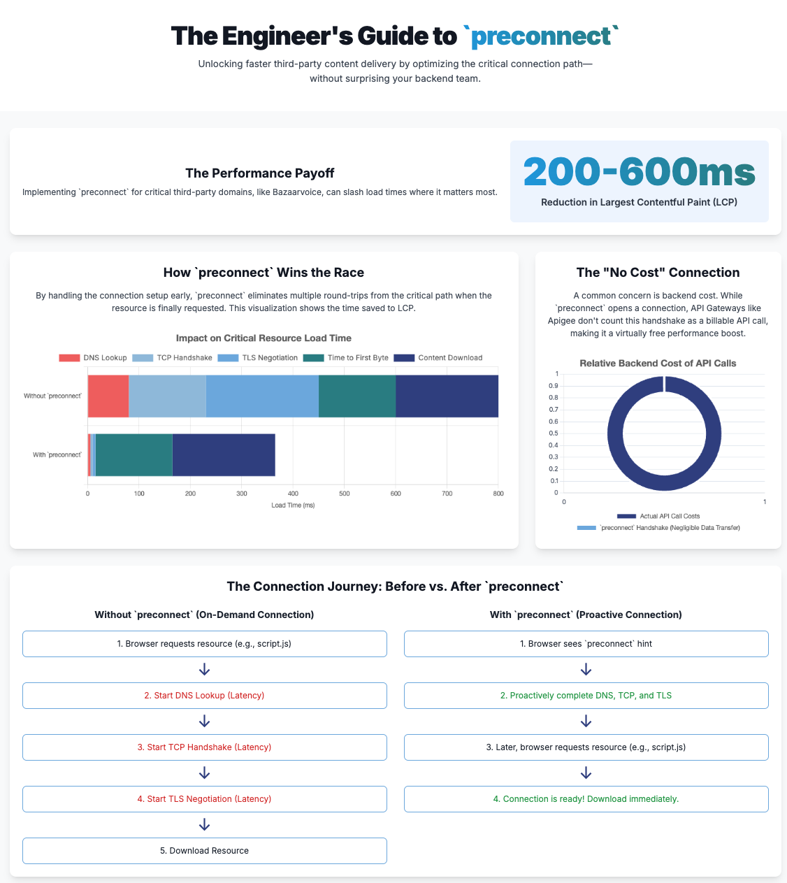
Preconnect directly tackles the significant latency introduced by the multi-stage network handshake. By completing DNS resolution, TCP handshake, and TLS negotiation preemptively, it effectively removes several critical round-trips from the critical rendering path when the actual resource is eventually requested.2 This pre-optimization can lead to measurable and substantial improvements in key performance metrics, including Largest Contentful Paint (LCP).10 This is particularly impactful if the third-party content, such as Bazaarvoice review widgets or critical scripts, is a significant component of the LCP element or is essential for the initial visual completeness of the page.
For Bazaarvoice, which serves Ratings and Reviews on product detail and listing pages across various websites, preconnect is a perfect solution. Our Display service retrieves content (static and dynamic) from apps.bazaarvoice.com, which is always a third-party domain to the client website. While our Display component is designed for lazy loading, the initial DNS lookup and TCP/SSL connection still consume valuable time, especially on mobile 3G networks.
By adding a preconnect hint for apps.bazaarvoice.com, the browser can proactively prepare the DNS lookup and SSL socket after the necessary TLS handshake. This means that by the time our Display component initiates its call to the backend, the underlying network connection is already “warm” and ready. This approach has demonstrably reduced the Largest Contentful Paint (LCP) value by 200-600ms, with the exact improvement varying by network capacity. This directly improves the Core Web Vitals metrics (LCP) for our Display component, making the reviews appear much faster for end-users.
Backend Implications: The (No) Count and (Low) Cost of preconnect
This is where we address the critical, often overlooked, aspect of preconnect: its influence on backend infrastructure and associated costs. While preconnect is a frontend hint, its strategic implementation requires understanding its server-side footprint.
When a browser honors a preconnect hint, it opens a TCP socket and initiates TLS negotiation. A key concern is what happens if this preconnected origin isn’t actually utilized within a reasonable timeframe. For instance, Chrome will automatically close an idle preconnected connection if it remains unused for approximately 10 seconds.14 In such cases, the resources expended on establishing that connection—including client-side CPU cycles and the minimal network bandwidth consumed by the handshake packets (around 3KB per connection for TLS certificates 14)—are effectively wasted. Preconnecting to too many origins can accumulate unnecessary CPU load on the user’s device and potentially compete with more critical assets for bandwidth.
From a backend perspective, every incoming connection, even just for a handshake (DNS, TCP, TLS), consumes some server-side resources: CPU cycles for TLS termination, memory to maintain connection context, and network capacity to handle handshake packets. While the resource consumption for an individual handshake is minuscule, the aggregate impact at scale can become considerable.
API Gateway and CDN Considerations: Pricing Models and Our Findings
The impact of preconnect on API Gateway and CDN costs requires a nuanced understanding of their billing models.
- API Gateways (e.g., AWS API Gateway, Google Apigee): These services primarily charge based on the number of “requests” processed (e.g., per million API calls).15 A preconnect operation itself does not constitute a “request” in the billing sense, as it’s a network handshake intended to prepare for a future request, not an actual data or API call that hits a backend endpoint. Therefore, preconnect operations do not directly incur per-request charges on these models.
- Bazaarvoice’s Own Testing: This is a crucial finding for us. We initiated preconnect calls from the browser and checked the usage metrics of APIGEE. Our analysis confirmed that these CONNECT calls were not counted or charged as API calls.17 This directly addresses the common concern about backend billing for preconnect operations.
- Data Transfer Fees: The small amount of data exchanged during the TLS certificate negotiation (approx. 3KB) would count towards data transfer fees.14 While negligible per preconnect, it is a non-zero component at massive scale.
- CDNs (Content Delivery Networks): CDNs typically base their pricing on data transfer volume and the number of requests served. preconnect itself does not involve the transfer of content, so it does not directly incur content delivery costs. Similar to API Gateways, the TLS handshake data would contribute minimally to CDN metrics. The primary benefit of preconnect for CDN-served assets is the acceleration of content delivery after the connection is established.
The Bottom Line on Cost: preconnect operations incur minimal direct financial cost in terms of “requests” on typical API Gateway or CDN billing models, as they primarily involve connection setup rather than full data requests. They do consume a small amount of bandwidth for TLS certificates and some server-side CPU/memory for managing the connection. The most significant “cost” associated with preconnect is the potential for wasted client and server resources if the established connection is ultimately unused.
Strategic Implementation: Bazaarvoice’s Approach and Your Takeaways
Effective preconnect implementation demands a strategic approach. It involves careful identification of critical origins and balancing performance gains with backend efficiency.
For Bazaarvoice, the strategy was clear: target the domains serving our core content. This primarily means apps.bazaarvoice.com, which delivers our Display service. Since this domain is always a third-party origin for our clients, it’s a prime candidate for preconnect.
Our Display component is designed to lazy-load, but the initial DNS lookup and TCP/SSL connection still consume significant time. By adding a preconnect hint for apps.bazaarvoice.com, client browsers can proactively perform the DNS lookup and establish the SSL socket, including the necessary TLS handshake, before the Display component even starts requesting data.
The Results: Our implementation of preconnect for *.bazaarvoice.com has demonstrably reduced the Largest Contentful Paint (LCP) value, depending on network capacity. This directly improved the Core Web Vitals metrics for our Display component.
Crucially, our internal testing with APIGEE confirmed that these preconnect calls were not counted or charged as API calls. This validates the “no count, low cost” aspect for backend services, proving that you can achieve significant frontend performance gains without unexpectedly inflating your API Gateway bill.
Your Actionable Takeaways:
- Identify Critical Origins: Don’t preconnect everything. Focus on the 1-3 most critical cross-origin domains that are essential for your page’s initial render or LCP. Over-preconnecting can be counterproductive.4
- Use crossorigin: If your preconnected resource uses CORS or is loaded anonymously (like fonts), always include the crossorigin attribute.6
- Connect Promptly: Ensure actual resource calls occur within 10 seconds of preconnect. Connections idle for longer than this timeframe will be lost, requiring a new TCP handshake, though DNS resolution will remain cached based on its TTL.
- Monitor and Iterate: Performance optimization is an ongoing process. Use tools like Lighthouse, WebPageTest, and Real User Monitoring (RUM) to track frontend metrics. Simultaneously, keep an eye on your backend: active connection counts, CPU utilization, and API Gateway logs. This holistic view helps ensure frontend optimizations don’t create new backend bottlenecks or unexpected costs.
- Test for Cost: If you’re concerned about API Gateway or CDN costs, do your own small-scale tests, just like we did with APIGEE. Verify how preconnect operations are logged and billed by your specific providers.
Infographics
Conclusion
Preconnect is a powerful, yet nuanced, tool in the web performance toolkit. Its primary strength lies in its ability to significantly improve the perceived performance of web pages by proactively accelerating the loading of critical cross-origin resources. By completing DNS resolution, TCP handshake, and TLS negotiation preemptively, it ensures that when the actual resource is needed, the connection is already warm and ready, reducing critical path delays.
It is crucial that the actual resource calls occur within 10 seconds of the preconnect being established. Exceeding this timeframe will result in the loss of the socket and necessitate another TCP handshake. Nevertheless, the DNS lookup time will be reduced due to DNS resolution, which is governed by the DNS TTL.
While preconnect itself does not directly incur significant monetary costs in terms of “requests” on typical backend API Gateway billing models (as Bazaarvoice’s APIGEE testing confirmed), it’s not entirely “cost-free.” It consumes client-side CPU resources, minor network bandwidth, and requires server-side resources for connection management. Overuse or misapplication can lead to wasted resources.
Strategic implementation is paramount. By identifying critical origins and diligently monitoring both frontend performance and backend resource consumption, you can leverage preconnect to deliver faster, more responsive web experiences to your users, without incurring unexpected backend costs. It’s about smart, targeted optimization that benefits everyone.
Works cited
- Resource Hints – W3C, accessed July 15, 2025, https://www.w3.org/TR/2023/DISC-resource-hints-20230314/
- Preconnect – KeyCDN Support, accessed July 15, 2025, https://www.keycdn.com/support/preconnect
- DNS Prefetch vs. Preconnect: Speeding Up Your Web Pages – DhiWise, accessed July 15, 2025, https://www.dhiwise.com/blog/design-converter/dns-prefetch-vs-preconnect-speeding-up-your-web-pages
- rel=”preconnect” – HTML | MDN, accessed July 15, 2025, https://developer.mozilla.org/en-US/docs/Web/HTML/Reference/Attributes/rel/preconnect
- Optimize Largest Contentful Paint | Articles – web.dev, accessed July 15, 2025, https://web.dev/articles/optimize-lcp
- Using dns-prefetch – Performance – MDN Web Docs, accessed July 15, 2025, https://developer.mozilla.org/en-US/docs/Web/Performance/Guides/dns-prefetch
- DNS Prefetching – The Chromium Projects, accessed July 15, 2025, https://www.chromium.org/developers/design-documents/dns-prefetching/
- HTTP Request Method: CONNECT – Web Concepts, accessed July 15, 2025, https://webconcepts.info/concepts/http-method/CONNECT
- developer.mozilla.org, accessed July 15, 2025, https://developer.mozilla.org/en-US/docs/Web/HTML/Reference/Attributes/rel/preload#:~:text=The%20preload%20value%20of%20the,main%20rendering%20machinery%20kicks%20in.
- rel=preload – HTML | MDN, accessed July 15, 2025, https://developer.mozilla.org/en-US/docs/Web/HTML/Reference/Attributes/rel/preload
- Browser Resource Hints: preload, prefetch, and preconnect – DebugBear, accessed July 15, 2025, https://www.debugbear.com/blog/resource-hints-rel-preload-prefetch-preconnect
- Prefetch – Glossary – MDN Web Docs, accessed July 15, 2025, https://developer.mozilla.org/en-US/docs/Glossary/Prefetch
- Exploring the usage of prefetch headers – Lion Ralfs, accessed July 15, 2025, https://lionralfs.dev/blog/exploring-the-usage-of-prefetch-headers/
- Preload, Preconnect, Prefetch: Improve Your Site’s Performance with Resource Hints, accessed July 15, 2025, https://nitropack.io/blog/post/resource-hints-performance-optimization
- AWS API Gateway Pricing Explained, accessed July 15, 2025, https://awsforengineers.com/blog/aws-api-gateway-pricing-explained/
- Amazon API Gateway Pricing | API Management | Amazon Web Services, accessed July 15, 2025, https://aws.amazon.com/api-gateway/pricing/
- Monitor Pay-as-you-go billing | Apigee – Google Cloud, accessed July 15, 2025, https://cloud.google.com/apigee/docs/api-platform/reference/pay-as-you-go-updated-billing


