
Pattern libraries sometimes fall short of helping enterprise teams build different products the same way. These palettes of components (toolbars, pop-ins) and patterns (searching, navigating) can be assembled into any number of UIs, leading to too many right answers. While the public pattern libraries like Google Material must accommodate countless unimagined applications, our private libraries can serve us better.
We have special insight into our own users’ workflows. A page type is a layout and set of patterns packaged together according to the workflow they support. If your pattern library is a basket of ingredients, your page types are the recipes.
These starting points are immensely helpful in a few ways:
- Designers starting from 80% instead of from scratch are more likely to approach their design problems in the same way.
- Development teams without designers often have everything they need to start building.
- Teams have vocabulary that connects patterns to workflows.
- Page types make workflow-specific pattern definitions possible.
Defining page types
Workflow-specific pattern definitions
Many pattern libraries, especially the older ones like Yahoo Design Pattern Library, take a bottom-up approach. Documentation starts with the component, noting its general purpose, but focusing primarily on its interactive states. A handful of examples show the component used in various contexts. It is up to designers to imagine how this information relates to their own projects.
Page types are top-down: in this workflow, these components are used in this way.
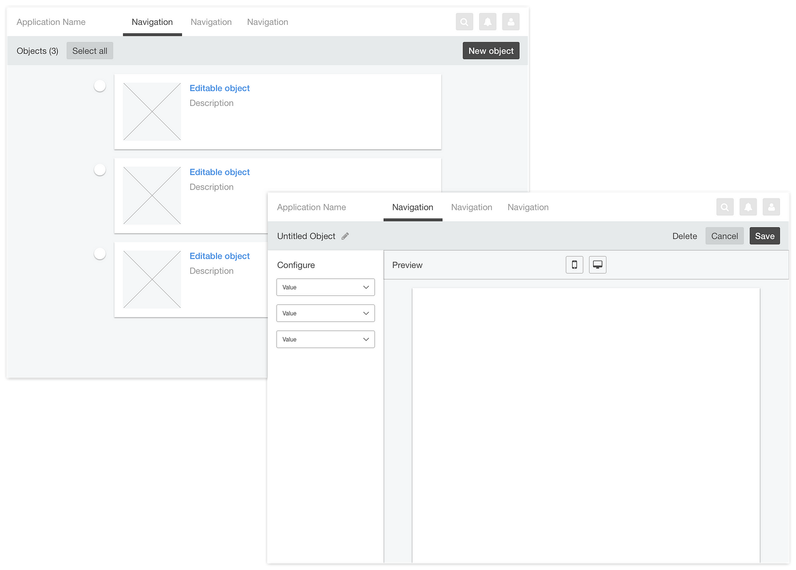
The example below shows two Object Editor pages with different interpretations of “Toolbar.” The top applies Google Material’s definition of Toolbar:
Toolbar actions appear above the view affected by their actions.
The bottom applies a workflow-specific definition of Toolbar:
If the object is edited indirectly and previewed, configuration actions and preview actions are separated into panel and toolbar, respectively. In this way, the user is not led to believe temporary preview modes (like zoom) are saved with their configuration.

It takes a lot of design thinking to work through how components could best serve a workflow. It is highly valuable, then, to document your best solutions.
Essential page types
Page type documentation prescribes the layout, component arrangement, and interactive patterns used to achieve a desired workflow. Here’s list of page types common to enterprise applications:
- Manager
Manipulate a collection of objects. - Editor
Edit an object. - Detail
Consume information through exploration. - Navigation
Consume information by reading it.
Identifying page types
In application design, the layout and use of components on any given page create a workflow that serve the page’s central purpose. If the central purpose of your application page is not singular, your design is probably overcomplicated. Before you invent a new page type, reconsider your application architecture.
For example, the central purpose of a document editor is to edit a document. If the page is well-designed, its layout maximizes the editable area, and its buttons and tools all relate to editing. Notice that Google did not smash document editing, management, and publishing into one page.
Optimizing workflows
Sometimes different workflows serve the same central purpose. For example, direct editing and configuration are very different workflows even though their central purpose, Object Editing, is the same. In cases like these, it’s appropriate to offer variations.
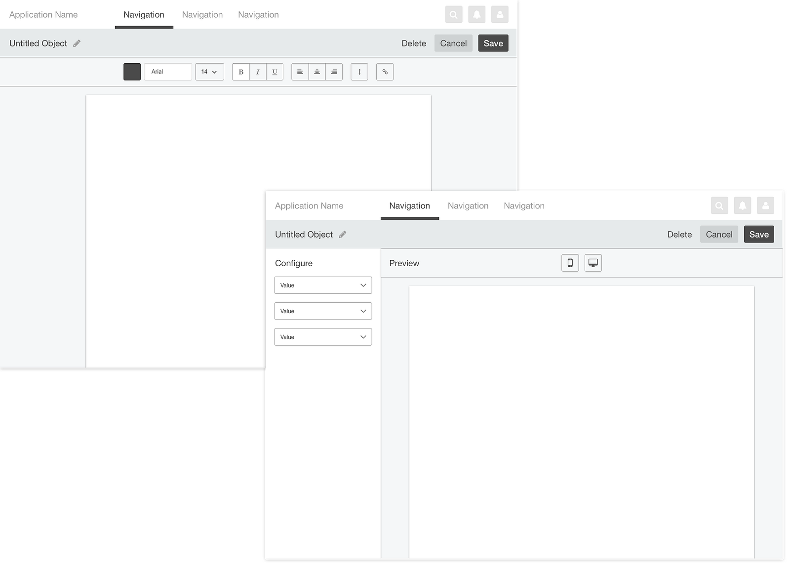
While page types promote focused design, discipline should not compromise usability. In the examples above, direct editing is the easiest way to work with text. Configuration is the easiest way for non-technical users to change XML values, build an email template, or add filters to a photo, etc.
Optimizing content presentation
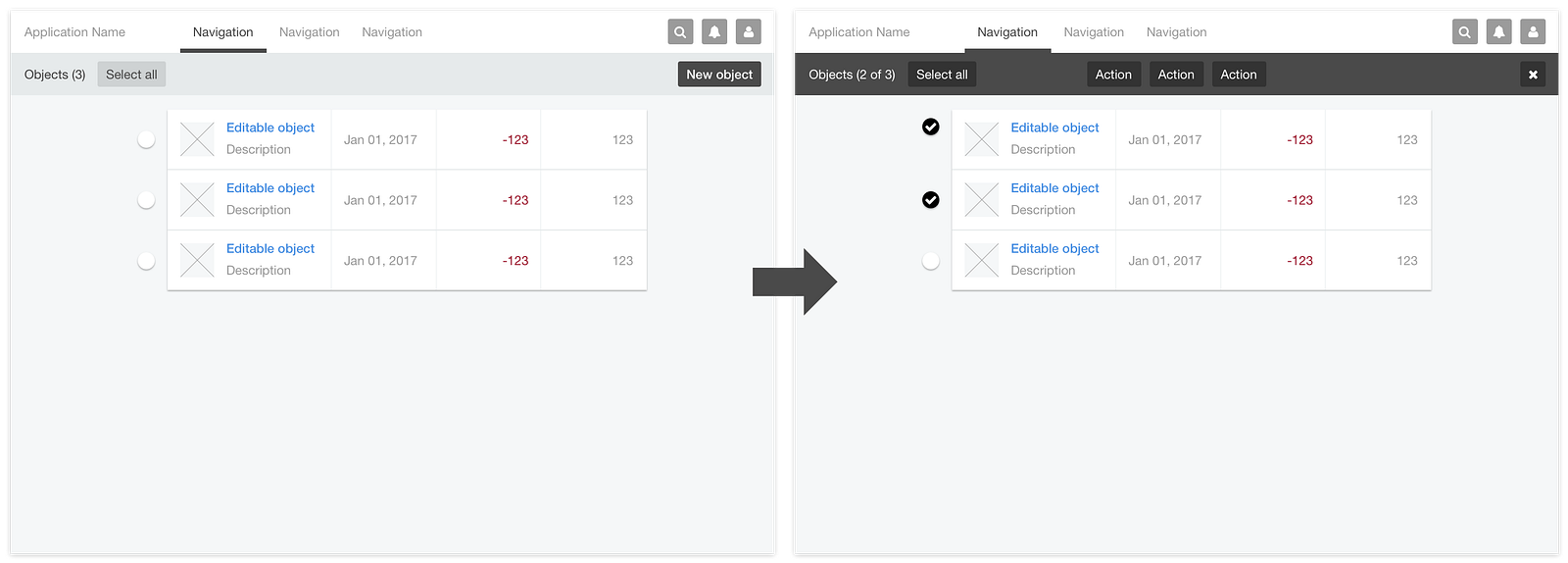
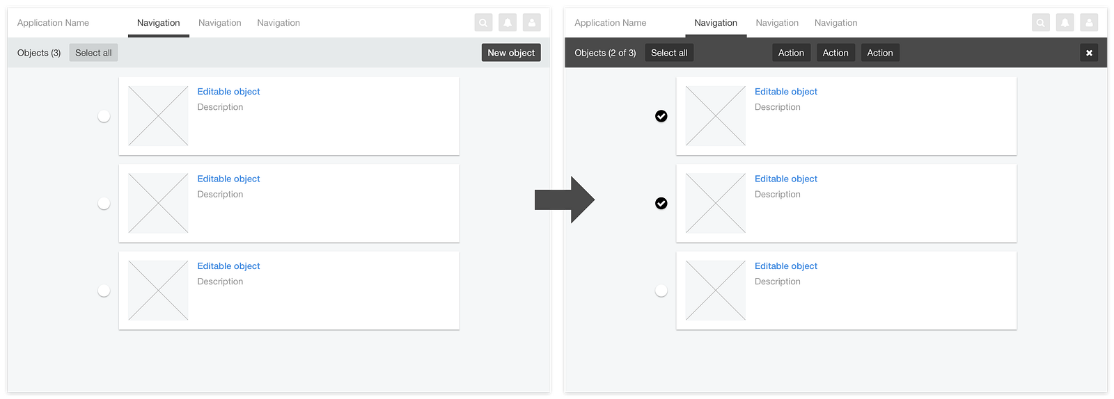
It’s important to differentiate between workflow and content presentation: tables emphasize data, lists emphasize titles, cards emphasize media, etc. If the workflow is the same, one page type can house various content types in their optimal formats. In the Object Manager examples below, relevant activities—finding, filtering, selecting, applying actions, etc.—are the same and can be accessed the same way.
Similarly, let workflow define your page types, not content presentation or layout. “Table page” is not a good page type because your users do not want to table.
Using page types
Page type templates accelerate design and development projects by advancing their starting points. They also simplify the information architecture design process by providing constraint:
Each screen maps to a page type.
Therefore, each screen represents a workflow with singular purpose. Adhering to this principle influences decisions around how to group functionality into various pages.

An IA design that uses your company’s set of established page types as illustrations is more tangible to stakeholders.
What are your page types?
Page types are not new; website designers—especially those who use template-based CMS’s like Joomla—have been using them all along. They are essential to Information Architecture.
We application designers have been somewhat distracted. Pattern libraries—especially when incorporated into UI development environments like Storybook—are incredibly useful. However, only we know what we want to help our users do. Our own private pattern libraries can be far more workflow-aware than the public libraries from which we draw our inspiration.
What are your page types?
This post was originally published on Medium.com